I have spent the last month or so working on getting all of this working MECHANICALLY and from a technical standpoint but I am having a NIGHTMARE of a time getting this to LOOK the way I want it to. Its NOT the CSS or JavaScript or the art or the styles… ITS THE GODDAMN WORD PRESS FRAMEWORK FIGHTING EVERY FRIGGING STYLE CHANGE I MAKE… So I am stripping down the core functionality of word press as a BLOG and COMMENTS feeder to a completely 100% customized version of my front end… because fuck you and your stupid limitations. I WANT WHAT I WANT, AND >>>> I ALWAYS GET WHAT I WANT <<<<
If you ever heard the saying if you want it done RIGHT sometimes you just gotta do it yourself. The database and data stuff was the HARD part… now its re-architecture – a MOCK of a BLOG process which is pretty easy from a data standpoint I think – not to mention the framework is pretty common SO I just gotta rebuild the database and since MY GAME DATA and GAME stuff is completely separate to begin with this should NOT be a problem. I just wanted to make it EASY for others to replicate the game process with their OWN stories and customization options without having to do too much work on the back end stuff like tweaking the JavaScript or CSS or especially not touching the DATABASE or pipeline interfaces… They are complex and fragile so I dont want anyone touching them. Its hard enough for ME to maintain the engineering in my own noggin last thing I need is someone trying to re-engineer it with AI or their collegiate genius skillets. Honestly I sound like a dick there, but truthfully nobody has ever really accused me of being too nice… At the end of the day I am a bit neurotic and on the spectrum about certain things we will call OCD’s… Which is not really a big deal as far as the customization’s go – I will just create database tables with the OPTIONS in there and allow the users to update it from the “administration” forms… Its just more work for me to build is all… Anyway here is what I have put together so far… I am still scaling and adjusting so dont squawk about its looks like blah blah blah or anything I dont CARE IF YOU DON’T “LIKE” IT… I like it so far and I am building this MY way… Don’t get me wrong I LOVE to hear the feedback but the “complaints” about its LOOKS broken, or LOOKS like “shit” or its SHOULD LOOK like this or that, or I think its better if its… I DON’T WANT TO HEAR… DEV IS NOT FOR LOOKS ITS FOR I HAVE AN IDEA – CAN I MAKE IT WORK… And I am building this MY WAY… If you want it YOUR way, YOU BUILD IT. Until then keep on poking around in my fun zone and telling what you think would be cool not what you think would LOOK cool. We will DEFINITELY get to that but for now its ARCHITECTURE AND ENGINEERING TO BUILD THE ENGINE… and occasionally play with the looks…
Here’s a quick video of the UI I am working on… I want it 100% MOBILE friendly without having to INSTALL ANYTHING… so CSS and JavaScript is SUPER strict for view port… THIS is the desktop presentation NOT the mobile… I will tack on some phone screen captures shortly… The MOBILE which is the GOAL has a much longer mid section (body) where the text and images are shown along with the narrator and visuals for the dice, maps and campaign videos.
I’m pretty proud of this one too so dont shit on it.
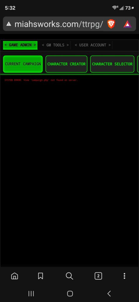
Mobile needs more space eating but that will be consumed by the images and text and videos…
oooohh blue song 2…. SQUIRREL!!!!
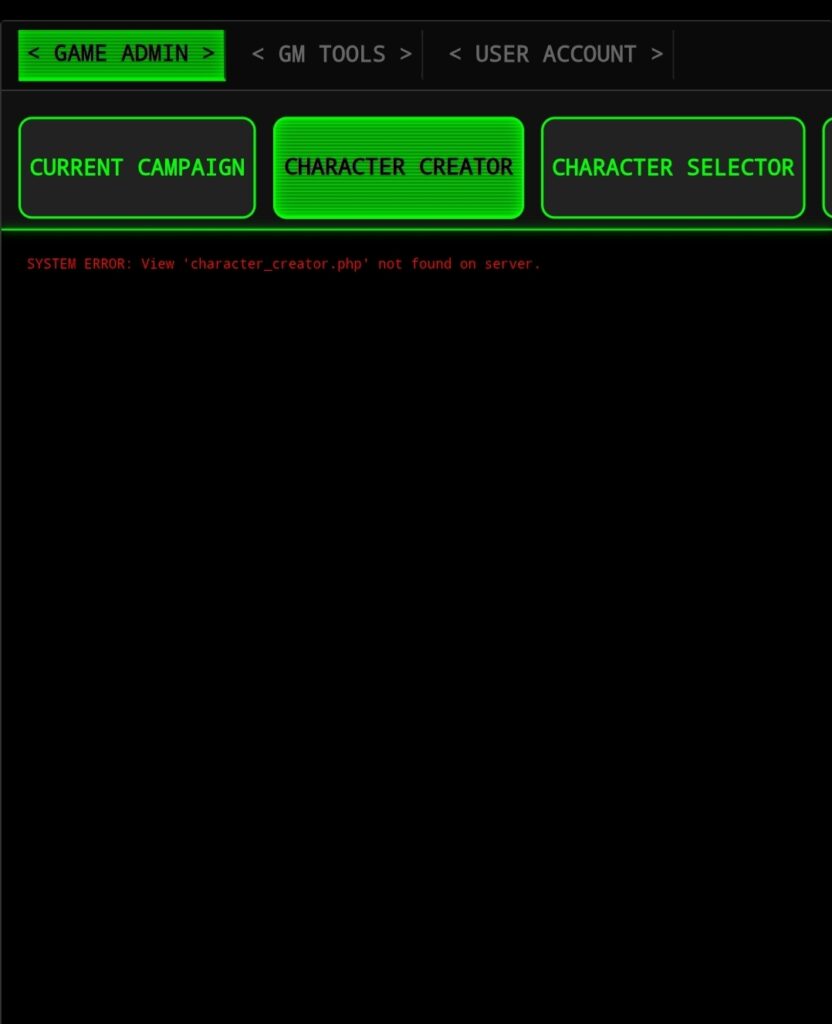
more tweaking and more layout modelling… not my strong skills but I got a vision of what I want to see so I will make it happen.
Hope you stick around for it!